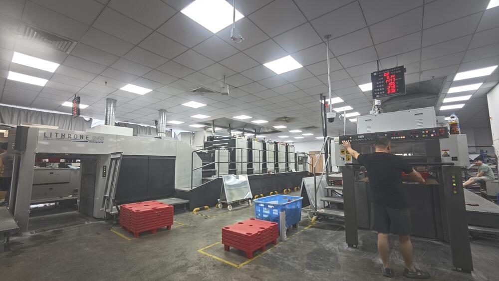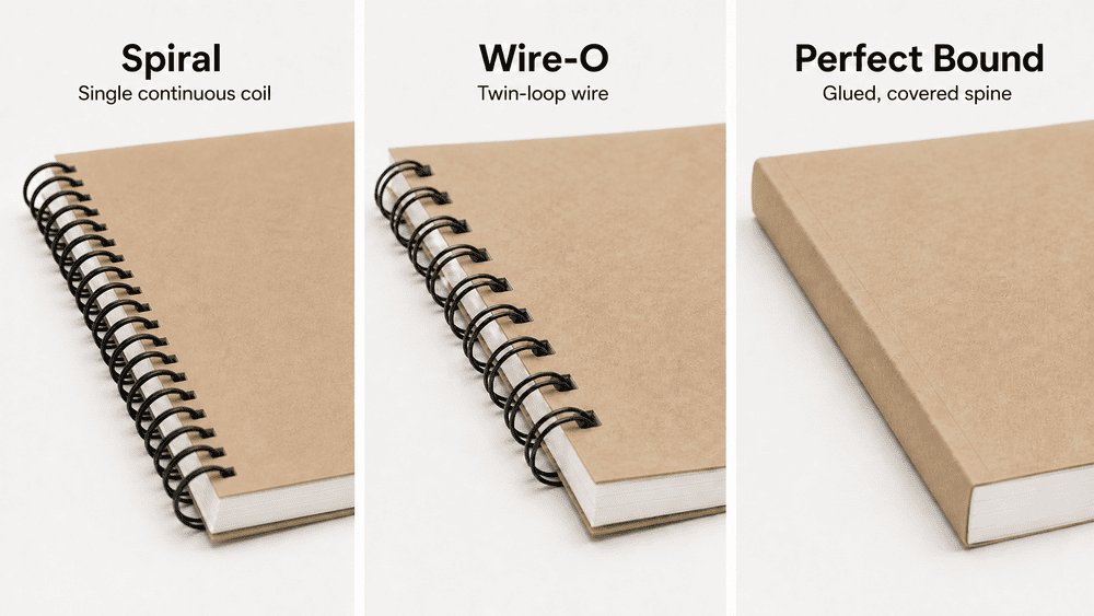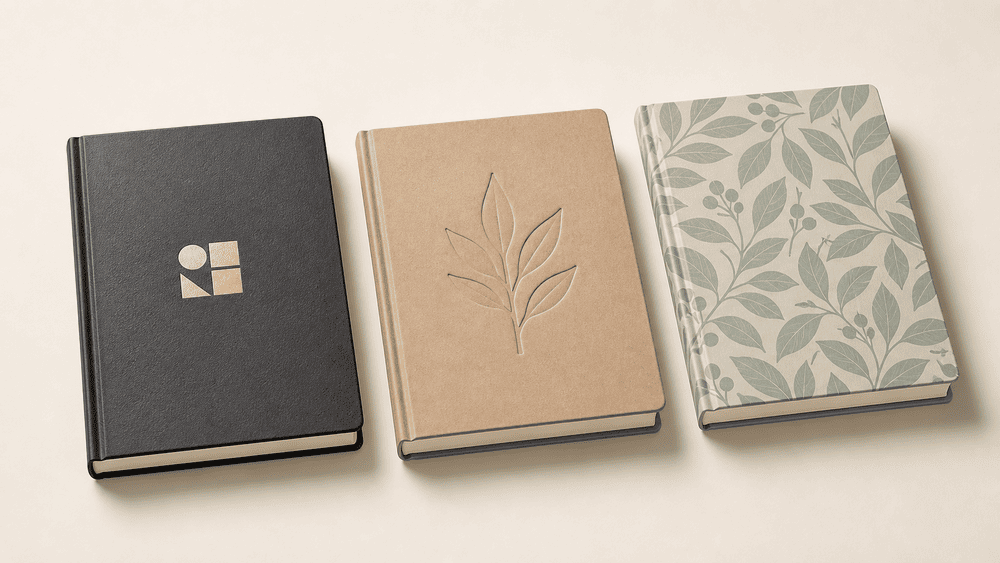
Hot stamping, embossing, and gravure printing can all decorate a notebook cover, but they do not do the same job. These three notebook cover printing methods create different effects and require different artwork, tooling, and production planning.
Hot stamping transfers a foil or pigment layer onto the cover. Embossing changes the physical shape of the cover to create a raised design. Gravure printing transfers ink from engraved cells and is used to reproduce colors, patterns, gradients, and detailed artwork, usually on material before the cover is assembled.
From a manufacturer’s perspective, the right choice depends on more than appearance. The cover material, construction, artwork detail, order volume, number of designs, required color consistency, tooling, and production sequence all affect whether a design can be reproduced reliably.
At YIMU, we review a cover concept as a manufacturing system rather than an isolated logo effect. A finish that looks attractive in a digital rendering must still work on the selected material, survive cover forming and handling, remain correctly positioned, and stay consistent throughout bulk production.
Hot Stamping vs Embossing vs Gravure Printing: Quick Comparison
| Factor | Hot Stamping | Embossing | Gravure Printing |
|---|---|---|---|
| What the process adds | A transferred foil or pigment layer | Physical raised relief | Printed ink and imagery |
| Main visual effect | Metallic, holographic, pearlescent, matte, or solid-color accent | Tactile, dimensional, usually tone-on-tone | Solid colors, fine patterns, gradients, illustrations, or photographic detail |
| Typical image carrier | Heated metal die | Matched male and female dies | Engraved printing cylinder, generally one cylinder per color station |
| Best artwork | Logos, titles, borders, icons, simple motifs | Logos, monograms, simple shapes, tactile patterns | Repeating patterns, full-surface graphics, tonal artwork, detailed multicolor designs |
| Color capability | Determined mainly by the selected foil | Normally no added color unless combined with another process | Spot colors or process-color printing, depending on the production setup |
| Tactile effect | Usually limited; a slight impression may occur | Primary purpose is a noticeable raised surface | Normally flat, although ink film and substrate texture can affect feel |
| Tooling | Custom stamping die | Custom matched dies | Custom engraved cylinders |
| Short-run suitability | Often practical when the finish area is controlled, subject to tooling cost | Possible, but tooling and setup must be justified | Usually less economical for short runs because cylinders and setup must be prepared |
| Long-run advantage | Repeatable premium accents | Repeatable tactile brand mark | High-speed printing and strong consistency across long production runs |
| Main design risk | Incomplete transfer, filling of fine details, poor adhesion, misregistration | Weak or uneven relief, loss of fine detail, damage or show-through on the reverse | Cylinder cost, repeat constraints, color separation errors, substrate and ink compatibility |
These are general manufacturing differences, not fixed quotations. The same logo can behave differently on coated paper, textured paper, PU, fabric, or film. A physical sample remains necessary before mass production.
Begin with the Cover Construction, Not the Decorative Effect
The word “cover” can refer to very different structures. Before preparing artwork, define what will actually receive the decoration.
Common possibilities include:
- A printed paper wrap mounted over greyboard for a hardcover notebook
- A specialty paper-wrapped case
- A PU or other synthetic leather cover
- A fabric-covered board
- A flexible printed film or coated material
- A softcover printed directly on card
This distinction changes the production route. Gravure printing is generally applied to a continuous paper, film, or other web material before it is cut and converted. A hot-stamped logo may be applied to a flat cover sheet, a cut piece of PU, or an assembled cover, depending on the construction and equipment. Embossing requires enough material response and appropriate backing to hold the relief.
For a factory, the key questions are:
- What is the exact face material?
- Is it smooth, textured, coated, laminated, porous, or heat-sensitive?
- Is the decoration applied before or after the material is mounted to the cover board?
- Will the design cross a spine, fold, rounded corner, groove, elastic position, or magnetic closure?
- Does the finish need to align with printed artwork?
- Can the approved result be held consistently across the order?
A useful notebook cover design begins with these production facts. Choosing “gold foil” or “deep embossing” before confirming the cover structure can lead to avoidable redesign and resampling.
What Is Hot Stamping on a Notebook Cover?
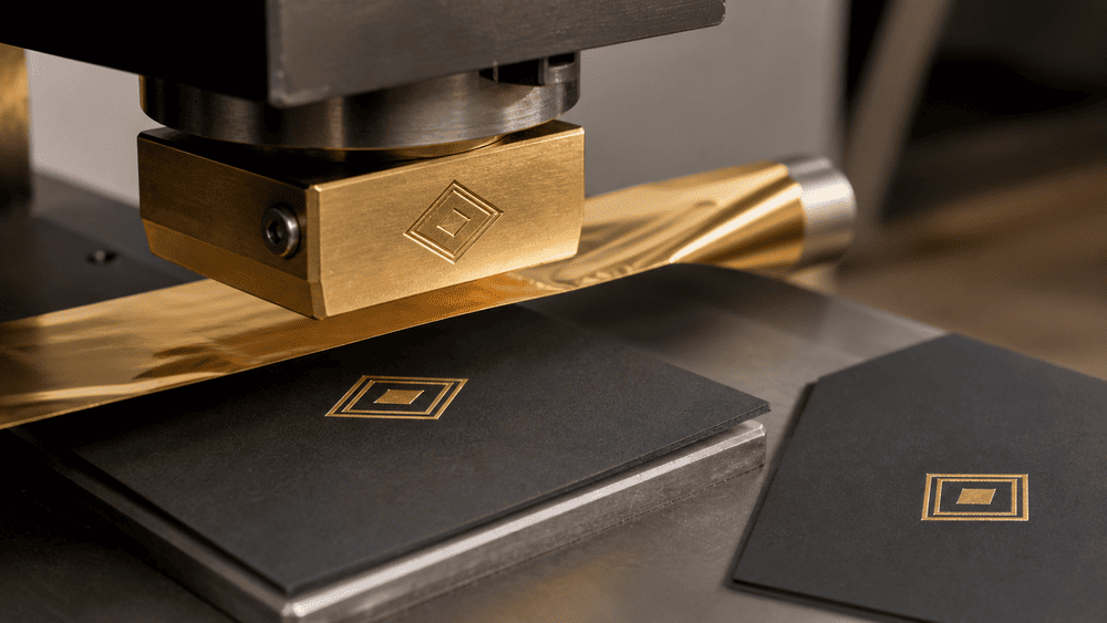
Hot stamping, also called hot foil stamping or foil blocking, uses a heated die, pressure, and contact time to release selected layers from a foil carrier and bond them to the substrate. This differs from embossing because hot stamping transfers material; blind embossing changes the substrate without adding a printed layer. The technical distinction is explained by HTWK Leipzig’s finishing reference.
On notebook covers, hot stamping is commonly considered for:
- A metallic brand logo
- A product title or short line of copy
- A border or corner detail
- A small icon or monogram
- A selected accent within a larger printed design
Gold and silver are familiar choices, but foil appearance is not limited to those colors. The possible result depends on the foil range, the cover substrate, and the approved sample.
Why Brands Choose Hot Stamping
Hot stamping creates a reflective or otherwise distinctive accent without printing a metallic gradient in CMYK. It can make a small logo more visible and may support a premium retail position without covering the entire notebook.
It also works well when a collection shares the same cover material and logo size but uses different cover colors. One stamping die may be reusable across versions if the artwork dimensions and position remain identical. However, the factory must confirm whether the same foil and machine settings are suitable for every material color or surface.
Hot-Stamping Artwork Guidelines
Prepare the stamping design as a separate vector layer, using a clearly named spot color such as FOIL. The color on screen is only an identifier; the actual appearance comes from the selected physical foil.
For production-ready artwork:
- Use solid vector shapes rather than photographic effects.
- Convert essential type to outlines after the wording has been approved.
- Avoid gradients, transparency, soft shadows, and raster textures inside the foil layer.
- Keep very fine lines, tiny counters, and narrow gaps out of the design unless the factory confirms they can be held.
- Avoid using a large solid foil area merely to imitate a full printed background; broad areas can be more difficult to transfer uniformly.
- Keep the design away from folds, rounded edges, cover grooves, stitching, elastic attachments, and other uneven pressure zones.
- Supply the exact finished size and position, not only a logo file without placement instructions.
- Identify each foil color separately when more than one is required.
Do not invent a universal minimum line width or gap. The workable limit depends on the die, foil, substrate, surface grain, stamping area, and press setup. Ask YIMU to review the actual vector artwork at final size.
What the Factory Tests
During sampling, a manufacturer adjusts the relationship among temperature, pressure, dwell time, foil, and material. Too little transfer can leave pinholes or missing areas. Excessive pressure or heat can spread the image, fill small gaps, mark the cover, or affect heat-sensitive materials.
The sample should be checked for:
- Complete and even transfer
- Clean edges and open letter counters
- Correct location and orientation
- Adhesion to the selected cover surface
- Scratches, flakes, or unintended foil outside the design
- Acceptable appearance on textured areas
- Registration with any printed graphic beneath it
Approval should refer to a physical sample and a named foil, not simply “gold” in an email. Different gold foils can vary in tone, reflectivity, and behavior on the substrate.
What Is Embossing on a Notebook Cover?
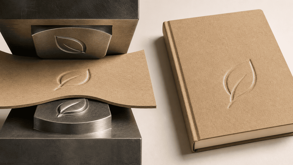
Embossing presses a design into the cover material with matched tooling so that the image rises above the surrounding surface. When the design is pressed below the surface, it is usually called debossing. A blind emboss or deboss creates relief without adding ink or foil.
This makes embossing fundamentally different from printing. The effect depends on light, shadow, material thickness, grain, backing, and viewing angle rather than an added color.
Embossing is often suitable for:
- A tone-on-tone logo on PU or paper
- A monogram on a minimalist cover
- A tactile title or simple symbol
- A subtle repeating pattern
- A brand mark intended to feel integrated into the material
Why Brands Choose Embossing
Embossing can communicate restraint. A raised or recessed mark does not need a contrasting color, so it can suit minimalist stationery and coordinated collections.
It is also tactile. That benefit, however, creates production constraints. A digital mockup can exaggerate depth and sharpness; real relief is limited by the face material, cover build, die geometry, pressure, and risk of marking the reverse side.
Embossing Artwork Guidelines
Like hot stamping, embossing should be supplied as clean vector artwork at final size. The manufacturer needs to understand not only the outline but also the intended relief.
Prepare the file as follows:
- Use solid shapes with a strong, readable silhouette.
- Separate raised, recessed, and flat areas clearly.
- State whether the design should be embossed or debossed.
- If more than one relief level is intended, provide a clear relief map and confirm that multi-level tooling is part of the quotation.
- Simplify very small text, sharp points, narrow channels, and closely spaced elements.
- Keep critical relief away from edges, seams, spine grooves, and hardware.
- Show the precise position relative to the finished trim and spine.
- Provide a side-view or written description if depth is a key design intention, while accepting that final depth must be established by the sample.
Fine detail is especially vulnerable on strongly textured PU, fabric, or soft padded covers. Increasing pressure is not always a solution; it may flatten the surrounding grain, distort the cover, or create visible marking on the reverse.
What the Factory Tests
The sample review should cover:
- Whether the relief is visible under normal light
- Sharpness and consistency around the perimeter
- Whether small counters and gaps remain open
- Even depth across the full logo
- Surface cracking, whitening, gloss change, or texture flattening
- Unwanted marks on the inside or reverse
- Location relative to the spine and cover edges
- Recovery of soft materials after pressure is released
Do not approve embossing only from a front-facing photograph. Review the physical cover by sight and touch from several angles.
What Is Gravure Printing for Notebook Covers?
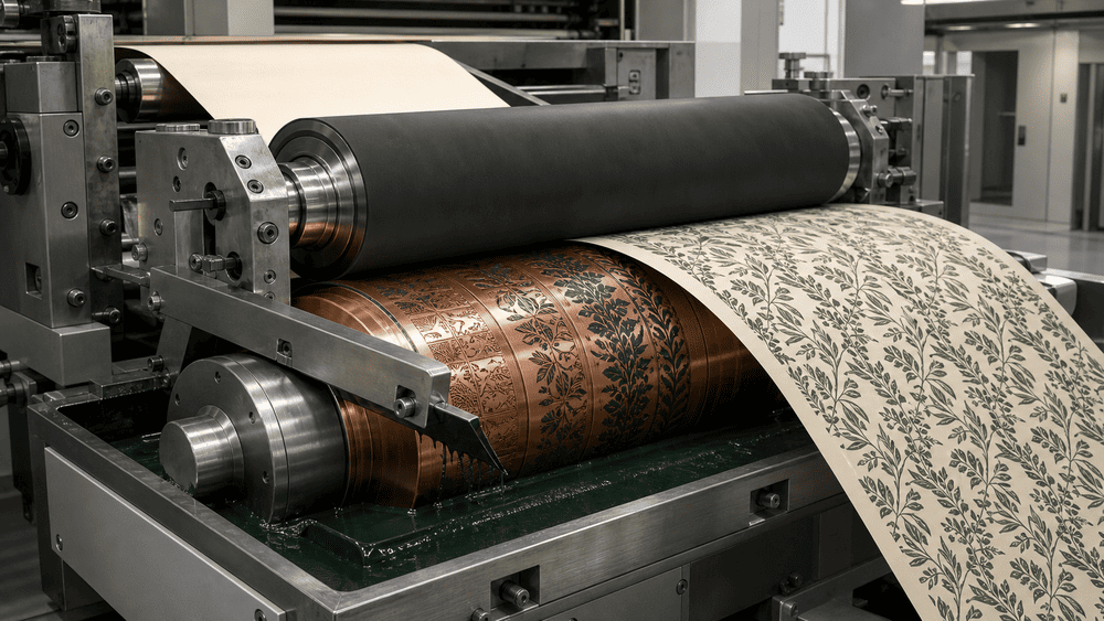
Rotogravure is a direct printing process. The image is engraved as microscopic recessed cells in a cylinder. The cells carry ink, a doctor blade removes excess ink from the non-image surface, and an impression roller brings the substrate into contact with the cylinder. The Global Rotogravure Association describes gravure as a high-speed process used for packaging, decorative papers, publications, and technical applications, with strong output consistency.
For notebook covers, gravure is most relevant when the cover concept requires printed material such as:
- A full-surface color or repeating pattern
- Detailed illustrations
- Gradients and tonal images
- Multicolor decorative paper or film
- A design repeated across a long production run
Gravure is not a tactile substitute for embossing. It normally creates a printed surface, not a raised logo. It is also not the usual choice for applying one small metallic logo to an already assembled notebook; hot stamping may be more direct for that purpose.
Why Brands Choose Gravure Printing
Gravure can provide consistent ink laydown, detailed reproduction, and efficient printing at scale. Its engraved cylinders are durable image carriers, making the process attractive for repeatable, high-volume production.
The tradeoff is setup. Cylinder preparation creates an upfront cost, and each printed color may require its own cylinder and station. For that reason, gravure economics usually improve as the run length increases. It may be a poor fit for a small order divided among many low-volume cover designs.
This does not mean every large notebook order should use gravure. Offset, flexographic, screen, digital, or other printing routes may be more suitable depending on the substrate, design, construction, and quantity. YIMU should confirm the proposed route during quotation rather than treating “gravure” as a general synonym for high-quality printing.
Gravure Artwork Guidelines
Gravure artwork can support more detail than a foil or embossing die, but the file still needs production planning.
Before finalizing the design:
- Build the artwork at the agreed print size and repeat.
- Confirm whether the design is a one-up cover image, a continuous pattern, or a web repeat that will later be cut.
- Supply editable source artwork and the requested production PDF.
- Keep critical text and logos away from trim, wrap, fold, and glue areas.
- Confirm process colors, spot colors, and color-separation requirements with the printer.
- Define brand colors with an agreed target and approve them on the actual substrate.
- Check image resolution at final size.
- Identify areas where several colors must register closely.
- Review how the pattern meets at the spine, wrap edges, corners, and back cover.
- Allow for the fact that the same ink can appear different on white, natural, metallic, transparent, or textured material.
Do not approve only a screen proof. A monitor cannot predict ink density, substrate color, gloss, lamination, or the appearance of a wrapped hardcover.
What the Factory Tests
For a gravure-printed cover material, sample and production checks may include:
- Color against the approved target
- Registration between colors
- Density and uniformity across the web
- Fine text and line reproduction
- Ink adhesion and rub resistance
- Drying and residual odor requirements where relevant
- Pattern repeat and cutting position
- Surface compatibility with lamination, coating, gluing, folding, or wrapping
- Color consistency between production batches
The approved print must also be tested after conversion into a notebook cover. A material can look correct as a flat sheet but reveal alignment, cracking, scuffing, or corner issues after wrapping and assembly.
Which Process Should You Choose?
Start with the design objective rather than the process name.
Choose Hot Stamping When
- The design needs a metallic, holographic, pearlescent, or solid foil accent.
- The artwork is a logo, short title, border, or simple motif.
- Contrast and reflectivity matter more than tactile depth.
- The finish area is controlled and the material passes foil-adhesion testing.
Choose Embossing When
- The brand wants a tactile, tone-on-tone effect.
- The artwork can be simplified into a strong silhouette.
- The cover material and construction can hold the relief.
- Subtlety is more important than multicolor reproduction.
Choose Gravure Printing When
- The cover requires continuous color, patterns, gradients, or detailed illustrations.
- The material will be printed before cutting and cover assembly.
- The production volume and repeat plan can justify engraved cylinders and press setup.
- Long-run print consistency is a priority.
Combine Processes When Each Has a Clear Job
A cover does not always need to choose only one process. For example:
- Gravure printing can create a background pattern, while hot stamping adds a metallic logo.
- A printed paper wrap can be embossed after printing to add relief.
- Hot stamping and embossing can be registered to create both foil color and dimension.
Every added operation increases tooling, setup, registration, sampling, handling, and inspection requirements. The design should justify that complexity. A premium result usually comes from a clear hierarchy, not from applying every available finish.
How the Process Changes MOQ, Cost, and Lead Time
Buyers often ask which finish is cheapest, but no method has one fixed cost independent of the design.
Tooling
Hot stamping requires a die. Embossing requires matched tooling. Gravure requires engraved cylinders, typically linked to the print colors and repeat. New artwork, size changes, or sometimes position changes can require new tooling.
Tooling cost should therefore be evaluated per design and per size, not only per order. A collection with six covers may share one logo die if the dimensions and placement are identical, while six different full-cover gravure designs may require separate image carriers.
Setup and Waste
The factory needs material for setup, color adjustment, pressure adjustment, registration, and quality stabilization. Complex registration or difficult substrates can increase setup effort and waste.
Order Allocation
Total order quantity is not the only number that matters. The quantity per cover design, color, size, and finish combination affects production efficiency. An order split into many variants may require repeated tooling changes and setups.
YIMU’s existing content explains why the custom notebook MOQ depends on materials, printing, finishing, construction, and SKU allocation rather than one number alone. The same principle applies to cover-decoration decisions.
Sampling
A digital rendering can confirm layout but not transfer, relief, ink appearance, or adhesion. Physical sampling is especially important when:
- The material is textured or heat-sensitive.
- The design uses very fine foil details.
- Embossing depth is central to the concept.
- A printed pattern must align around a spine or corner.
- Several processes must register with one another.
- The selected material or foil has not been tested previously.
Use the custom notebook sample checklist to review the cover together with paper, binding, accessories, and packaging before approving mass production.
Common Notebook Cover Design Mistakes
Treating a Digital Effect as a Manufacturing Specification
A metallic gradient in a rendering does not define a foil. A Photoshop bevel does not define embossing depth. A screen color does not define printed ink on the chosen substrate. Provide separate production layers, physical references where appropriate, and written specifications.
Selecting the Finish Before the Material
The same foil, die, or ink does not behave identically on every cover. Select the construction and face material early, then evaluate decoration compatibility.
Making Fine Artwork Too Small
Thin lines, small counters, and narrow spaces may close during hot stamping or lose definition during embossing. Review the design at its actual finished size, not enlarged on a monitor.
Ignoring the Spine and Conversion Areas
Artwork that looks centered on a flat rectangle may move visually after wrapping over a board, forming a spine, adding a groove, rounding corners, or attaching an elastic band. Use the manufacturer’s dieline and show the front, spine, and back as one production layout.
Dividing One Order into Too Many Versions
Each additional colorway or cover graphic can create more setup, cylinder, material, sample, and inspection requirements. Decide which elements can be standardized across the collection.
Approving One Process in Isolation
A foil logo may be clean before the cover is folded but too close to the edge after assembly. Gravure printing may match the color target before lamination but shift in appearance afterward. Approve the finished notebook, not only a flat decorated sheet.
A Manufacturer-Focused YIMU Development Workflow
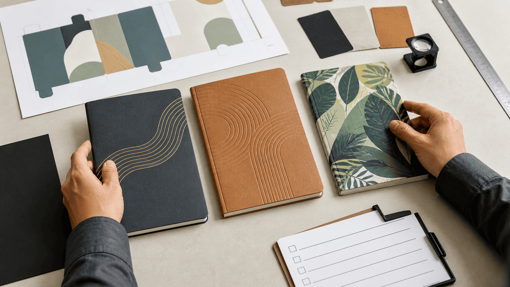
YIMU supports OEM and ODM notebook projects for brands, importers, wholesalers, and stationery buyers. Our role is to translate the visual concept into a complete, repeatable specification rather than simply accept a finish name.
A practical workflow is:
- Define the product: notebook size, cover construction, binding, page count, inner paper, accessories, packaging, quantity, and SKU allocation.
- Review the cover artwork: identify printed layers, foil layers, relief areas, trim, spine, folds, grooves, and hardware positions.
- Check manufacturing compatibility: match the proposed process with the face material, cover build, design detail, and production quantity.
- Confirm the production route: determine when the cover material will be printed, stamped, embossed, cut, mounted, wrapped, and assembled.
- Quote tooling and unit production: separate one-time or design-specific setup items where relevant so the buyer can understand the cost structure.
- Produce and review a physical sample: confirm appearance, touch, placement, adhesion, relief, color, and the complete notebook construction.
- Freeze the approved specification: connect the approved artwork, material references, tooling version, sample, packaging, and quality criteria.
- Control bulk production: inspect the start of the run and monitor the characteristics that matter for the selected process.
The YIMU OEM and ODM notebook manufacturing service provides the broader framework for developing cover materials, logo applications, inner pages, binding, accessories, and packaging as one coordinated product.
YIMU’s published standard MOQ begins at 3,000 units, with the practical requirement depending on specification and order allocation. Published sampling guidance is generally 3–7 days and bulk-production guidance is generally 20–30 days, but custom tooling, material preparation, gravure cylinders, multiple finishes, approval rounds, and order complexity can change the schedule. Confirm the actual plan in the quotation rather than treating these ranges as guaranteed for every project.
See Notebook Production in Action

Cover decoration is only one stage in the notebook manufacturing process. This behind-the-scenes video from YIMU shows how pressing, binding, finishing, and careful handwork come together as a notebook moves from materials to a finished product.
Information to Send for a Notebook Cover Quotation
To receive a useful manufacturing review, provide:
- Finished notebook size and orientation
- Hardcover, softcover, flexible cover, or another construction
- Preferred face material and color, or a request for options
- Cover artwork at final size
- Separate vector layer for foil or embossing
- Intended foil color and finish
- Embossed or debossed direction
- Full-color or spot-color printing requirements
- Front, spine, and back layout
- Binding type and page count
- Accessories that affect the cover, such as elastic, pen loop, pocket, magnet, or closure
- Order quantity and quantity per design/color/size
- Target market, price position, and required packaging
- Reference sample or photographs, where available
- Required delivery date and destination
If the process has not been selected, send the visual objective instead. “A subtle black-on-black logo with a tactile feel” gives the factory more useful direction than choosing embossing before the cover material has been confirmed.
Frequently Asked Questions
Is hot stamping the same as embossing?
No. Hot stamping transfers a foil or pigment layer to the cover using a die, heat, and pressure. Embossing physically raises the cover surface using matched dies. They can be combined, but they remain separate manufacturing effects.
Is gravure printing the same as debossing?
No. Gravure is an ink-printing process that uses engraved cells in a cylinder. Debossing presses a design below the surface to create relief. The shared idea of a recessed image carrier or impression can cause terminology confusion, but the finished effects and equipment are different.
Can a notebook cover use hot stamping and embossing together?
Yes, provided the material, artwork, tooling, registration, and budget support the combination. A physical sample is needed to confirm both foil transfer and relief.
Which process is best for a small logo?
Hot stamping is often considered when the logo needs a metallic or contrasting accent. Embossing or debossing may suit a subtle tone-on-tone mark. The best option depends on line detail, size, surface texture, and cover construction.
Which process is best for a full-cover illustration?
Printing is normally more suitable than foil stamping or embossing for a detailed full-cover illustration. Gravure may be appropriate for specific long-run web-printed materials, while another printing method may be better for shorter runs or different substrates. Ask the manufacturer to propose the production route.
Can the same stamping die be used on several notebook colors?
Potentially, if the artwork size and geometry stay identical. The foil and settings still need to be tested against each cover material or colorway, and changes in logo size or tooling requirements may require a new die.
Why does the physical sample look different from the digital mockup?
The mockup simulates reflection, depth, texture, and color. The sample reflects actual foil, pressure, material grain, ink, lamination, cover construction, and lighting. Production approval should therefore be based on the physical sample and written specification.
Develop a Cover That Can Be Manufactured Consistently
The best notebook cover process is not the one with the most dramatic name. It is the one that supports the brand concept, works with the chosen material, fits the order structure, and can be repeated consistently in production.
Use hot stamping for a transferred accent, embossing for physical relief, and gravure for scalable printed color and imagery when the production route justifies it. Then validate the complete cover in a finished notebook sample.
Explore YIMU’s custom notebook products and OEM and ODM manufacturing options. When your cover concept, quantity, and target specification are ready, request a custom quote for a manufacturing review.